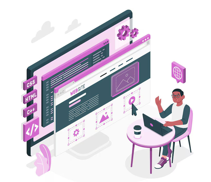
WordPress Development Services
Enhance your online presence with our expert WordPress website development services, tailored to meet your unique needs. As a leading WordPress designer, We specialize in creating responsive, user-friendly, and visually appealing websites through professional WordPress website design services. From custom themes to advanced functionality, our WordPress solutions ensure your site stands out, delivering performance and style seamlessly.
WordPress Development Company
At Webz Solutions, a leading WordPress website agency, we specialize in creating stunning, responsive, and user-friendly WordPress websites. Whether you need a simple blog or a feature-packed business website, our custom WordPress website design services deliver tailored solutions that drive results. With our expertise as a trusted WordPress website agency, we craft sites that deliver exceptional performance, seamless user experiences, and visually stunning designs tailored to your needs.
500+ Successful WordPress Websites Delivered
Proven expertise in creating dynamic, high-performing websites for diverse industries.
20+ Years of WordPress Experience
Trusted by clients for over a decade and a half, providing expert development and design services.
100% Project Success Rate
Delivering top-quality WordPress solutions with flawless execution, ensuring client satisfaction.
Tailored Solutions for Every Client
Custom WordPress websites designed to meet your specific needs and goals, ensuring a unique online presence.
Our WordPress Development Services

Custom WordPress Design
Custom WordPress Design combines creativity and functionality to craft unique websites tailored to your needs. Our expert WordPress designers specialize in WordPress website design, ensuring visually appealing, responsive, and user-friendly solutions. Whether you seek custom WordPress design for businesses or personal projects, we deliver exceptional results that elevate your online presence.

WordPress Development
Transform your digital vision into reality with our WordPress website development services. Our website designers specialize in creating scalable, responsive, and dynamic websites through custom WordPress development tailored to your needs. Whether it's an e-commerce or a business site, our solutions ensure seamless performance and a design that captivates your audience.

WooCommerce Development Services
Boost your online store's success with our expert WooCommerce Development Services. Our skilled WooCommerce developers craft customized, feature-rich e-commerce solutions to enhance user experience and drive sales. From seamless integrations to scalable designs, our WooCommerce development ensures your store stands out in the competitive digital marketplace.

WordPress Speed Optimization Services
Enhance your website's performance with our WordPress Speed Optimization Services. We use proven strategies to optimize WordPress website speed, ensuring faster load times, improved user experience, and better SEO rankings. Trust our experts to identify bottlenecks, fine-tune performance, and deliver a seamless browsing experience with top-notch WordPress speed optimization.

WordPress Website Maintenance
Ensure your website runs smoothly with our expert WordPress Website Maintenance services. We provide comprehensive support to keep your site secure, updated, and performing at its best. From regular backups to plugin updates, our WordPress Website Maintenance services guarantee optimal performance, security, and user experience.

WooCommerce Website Maintenance
Keep your online store running smoothly with our professional WooCommerce Website Maintenance services. We offer ongoing updates, security checks, performance optimization, and troubleshooting to ensure your store functions flawlessly. Trust our WooCommerce Website Maintenance experts to deliver a secure, fast, and reliable e-commerce experience.
Why choose Webz Solutions as WordPress Website Design Agency?
20+ years of WordPress expertise
With 20+ years of WordPress expertise, we create custom, responsive WordPress websites tailored to your business. Our skilled team ensures your site is secure, user-friendly, and optimized for performance and success.
Affordable Pricing, Uncompromised Quality
We offer affordable WordPress website design without compromising on quality. Our expert team ensures top-notch design, functionality, and performance, delivering excellent value for your investment.
Responsive & SEO-Friendly Designs
Our WordPress websites are fully responsive and SEO-friendly, ensuring a seamless user experience across all devices while boosting your search engine rankings for greater online visibility and success.
Ongoing Maintenance and Support
We offer ongoing maintenance and support for your WordPress website, ensuring it stays updated, secure, and performs at its best. Our team is always ready to assist with any updates or issues.
Our WordPress Website Development Process
Consultation
We begin by understanding your business objectives to create a tailored WordPress website that meets your unique needs and drives success.
Planning
We outline the structure and layout of your website, ensuring a seamless user experience with a well-organized sitemap and intuitive wireframe design.
Development
Our expert team builds a fully functional, responsive WordPress website, transforming your vision into a user-friendly, high-performance online presence.
Testing
We rigorously test your WordPress website across devices and browsers to ensure smooth functionality, speed, and security before launch.
Launch
We ensure a smooth transition from development to live, making your WordPress site fully operational and accessible to your audience for the first time.
FAQS on WordPress
Website Development
WordPress website development involves designing, building, and maintaining a website using the WordPress platform, known for its flexibility, ease of use, and customization options.
WordPress is user-friendly, SEO-friendly, and highly customizable, making it ideal for businesses of all sizes. It offers a wide range of themes, plugins, and features to suit your needs.
We specialize in custom WordPress development and can integrate unique features, plugins, and functionality to meet your specific business requirements.
Yes, WordPress is secure when properly configured and maintained. We implement best security practices, such as using secure plugins, regular updates, and strong passwords.
Yes, we offer ongoing WordPress website maintenance and support, including updates, security checks, backups, and troubleshooting to keep your website running smoothly.
Yes, we can redesign and revamp your existing WordPress site, improving its aesthetics, functionality, and performance to align with your evolving business goals.
// Drop us a line! We are here to answer your questions